Welcome to SoshiaConnect
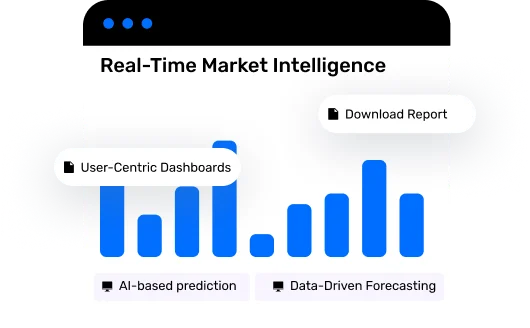
Your AI-Powered Portal for Maritime & Commodity Market Intelligence
- ✅ Data-Driven Forecasting
- ✅ Disruption Alerts (coming soon)
- ✅ Real-Time Market Intelligence
- ✅ Actionable, User-Centric Dashboards

Welcome to SoshiaConnect


Who We Serve
Leverage AI-powered insights to navigate market volatility, optimize your strategy, and stay ahead of the curve.
Optimize routing, risk, and revenue with predictive voyage economics.
Get real-time rate intelligence and port congestion updates.
Align trade flows with freight movement and shipping patterns.
Assess risk exposure with smarter shipping data.
Create stronger reports with integrated datasets.
SoshiaConnect is your gateway to Soshianest’s predictive analytics platform — built for shipowners, charterers, commodity traders, financial institutions, and market analysts.
AI-based prediction of freight rates across key trade routes.
Alerts on weather, strikes, congestion, and global risks (coming soon).
Tailored reports by route, region, vessel type, and time range.
Seamless integration into your tools — automate decisions in real-time.
Visualize KPIs, trends, and risk zones from one command center.
Compare vessel types, regions, and rates — side by side.
Why choose us
With decades of trading and freight analytics experience
For individuals, teams, and enterprises
With 99.9% uptime and secure access
Via APIs, Excel plugins, and data feeds
How it works
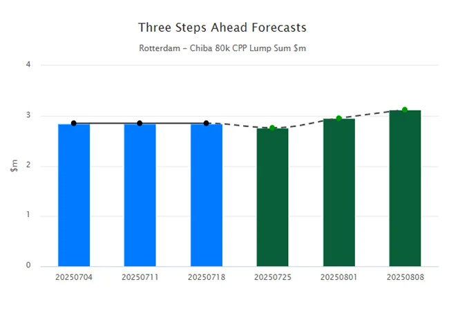
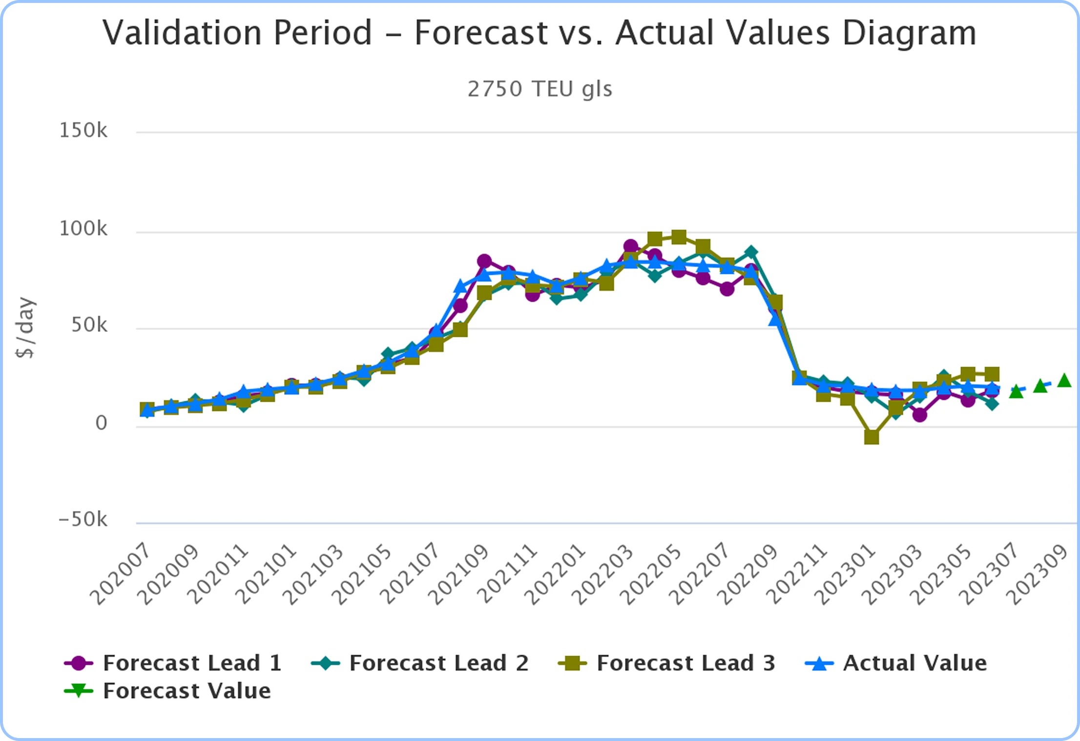
In order to ensure the accuracy of our predictions, we evaluate our models before publishing any predicted values. We conduct an evaluation test on the most recent [n periods*], during which we plot a diagram comparing the actual values to the predicted values using models for leads 1, 2, and 3 (shown on the left side of the diagram). You may click on the legend (under the diagram) to turn on/off each diagram to have a clearer comparison.
We report three upcoming values in four different periods of time and test the trained model on n recent models as below:
After comparing the actual values with predicted values from leads 1, 2, and 3 on the left side, we proceed to publish the forecasted values for the next three [periods] (as shown on the right side of the diagram). You may hover over each point to see its value.
*period can be Week/Month/Quarter/Annual
SoshiaConnect SaaS Software
Leverage AI-powered insights to navigate market volatility, optimize your strategy, and stay ahead of the curve.
Flexible Pricing Plans
Try it free for 7 days*. No credit card required.
The basic plan is perfect for small businesses and startups looking to get started.
Advanced plans are ideal for growing businesses with more complex needs.
A complete package for large companies that require comprehensive solutions.
Client Testimonial
25%
Complete business faster than before
Since using our services, our team's productivity has increased significantly to save time and costs.
Marketing Manager

45%
Complete business faster than before
Since using our services, our team's productivity has increased significantly to save time and costs.
Marketing Manager
55%
Complete business faster than before
Since using our services, our team's productivity has increased significantly to save time and costs.
Marketing Manager


Happy Clients
Satisfaction Rating
The average score from customer satisfaction surveys that recommend your services to others.
Get early access to new features, webinars, and exclusive freight updates.
Coming Soon
Be the first to react. Our machine learning engine is soon launching live alerts for:
